Thomas Wilshaw Notes
Random thoughts and notes that will probably mostly be about colour.
Film Shape
by Thomas Wilshaw
Exploring the shape of film
I’m currently working on a film project that was shot on Ektachrome S16mm film and I have been trying to figure out how to handle digital post production. The director’s initial plan was create a single master release print cut from the original negative which could then be projected to get the full effect and look of a film shot on reversal. However, this quickly became impractical, and it was decided we would do a complete scan of the film and do digital post production.
Ektachrome was first released by Kodak in the 1940s and survived in various forms till about 2013 when it was discontinued. Kodak restarted film production in 2018 and since then the stock has been used in minor ways in various film and music videos 1. Whilst there have been films, such as Buffalo ‘66, shot on Ektachrome in the pre digital era there have not been, to the best of my knowledge, any that were also finished digitally. This then raises the question, how do we handle digitally grading a full feature film shot on Ektachrome and scanned on a less than ideal scanner?
Due to budget constraints the film was scanned on a Filmfabriek HDS+ scanner and whilst this gave reasonably quality results the colour left a lot to be desired and seemed to be missing a lot of the colourfulness and punchyness inherent in Ektachrome. As it turned out however, a friend happened to be experimenting modelling with modelling film print papers and with a lot of help from him, I was able to use his techniques to model the Ektachrome film purely from the data sheet.
The overall approach is to model the film as seen by the Standard Observer and as seen by the scanner and then use the information to come up with a way to push the scanned files towards the “correct” look either visual and aesthetically or analytically. The results have so far been very promising and whilst I can’t share any test images I will try to explain the process here.
Density curves
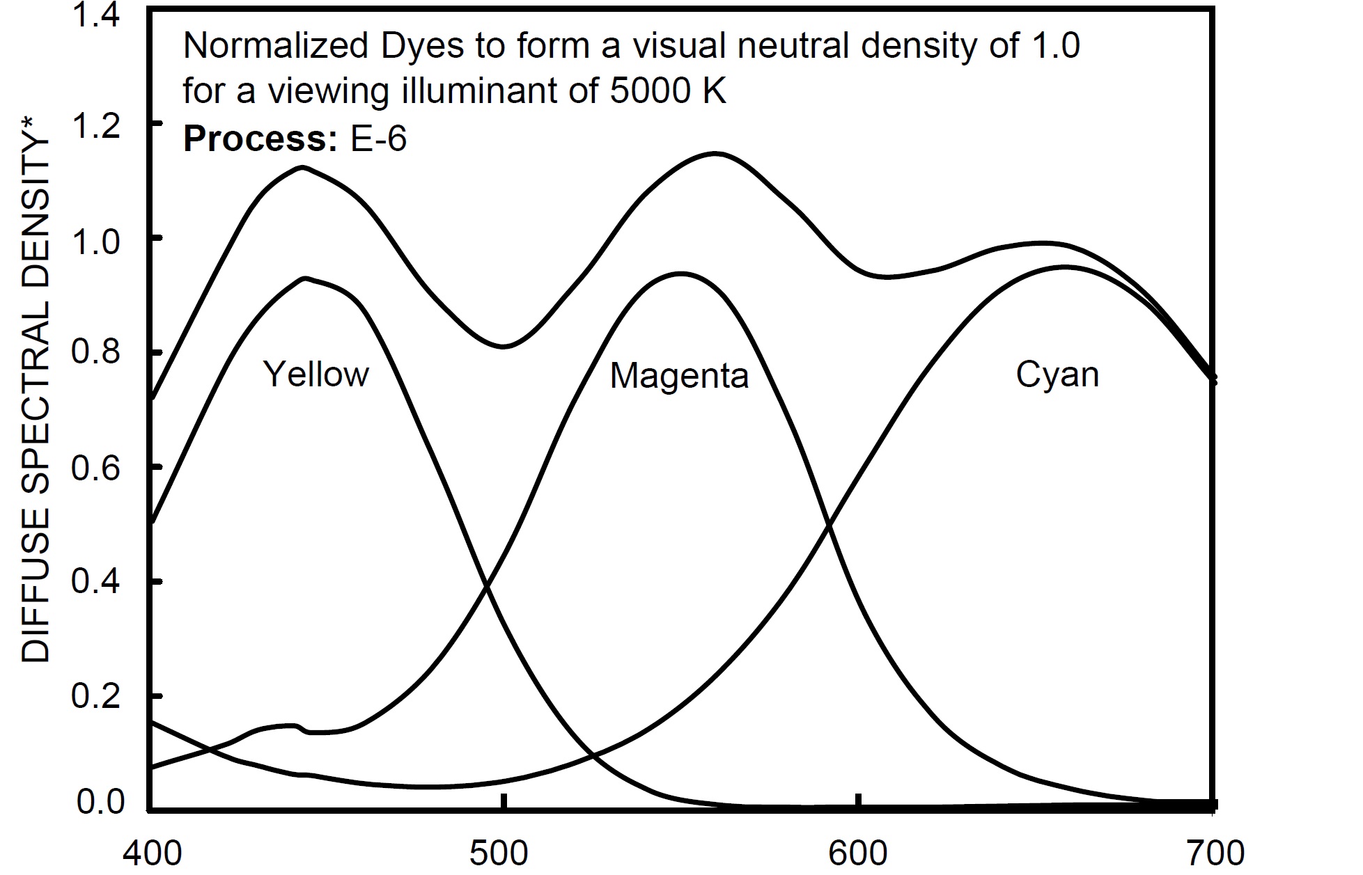
We begin with the dye curves found in most film data sheets (the example below is Kodak Ektachrome 100D). These show the densities of the three separate dyes (yellow, magenta and cyan) formed from light of the visible spectrum as well as a combined response that forms a neutral density. It is worth noting that the curves in these data sheets are usually low quality/precision and only really give a sense of the general shape and relationship between the three dyes. For example at about 450nm you can see all three dyes and the neutral density have a slight artificial kink in their curves and in the various different data sheets for the film (motion picture stock, stills stock, marketing etc.) all have slightly different curves and mismatched axis. However, for the majority of general cases this is plenty of data to be going with.
Density steps
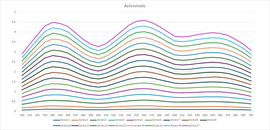
The curves given above are normalised response curves which means they have been linearly scaled by some amount to give a neutral response and this implies that an increase or decrease in exposure causes a similar scaling of the curves. Our next step then in to generate a series of density steps from D 0.1 to the DMax of the film, which in the case of Ektachrome 100D is approximately D 4.0 (also usually given in the data sheet). To get a better overview of the entire response of the film we also generate the hypothetical dye responses for the additive primaries (red, green and blue) and achromatic. These can be created by adding the initial three curves together in various combinations (cyan plus yellow makes green etc.). Below I have plotted the response of the seven dyes (real and hypothetical) at a selection of density steps (open the images in a new tab to get a better look at them).


Transmittance steps
However, we are more interested in the transmittance of the film, which is to say how it affects light projected through it. Calculating transmittance from density is straightforward:
If we apply the above formula to our data sets we get the following charts:


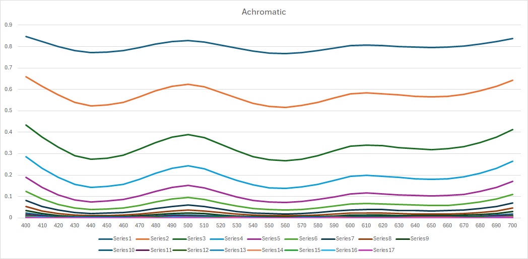
These curves are much more intuitive (to me at least) and tell us more about how the film will look when projected. For example, we can see that the magenta dye varies its transmittance a lot at different densities implying we can expect a lot of colour fidelity in those hues, whereas the yellows transmitted virtually everything from 560nm onwards and are mostly defined by how much blue they contain. This is the issue mentioned earlier in the article; the yellow transmittance above 560nm is 100% at all densities which strikes me as a little iffy and leads to incorrect looking yellows later on. This is probably caused by the original graph from the data sheet being inaccurate, and it would be interesting to try artificially raising the density of the yellow dye ever so slightly to get some variation here.
The Shape of Film
Now that we have a whole range of spectral data for the film at a variety of
density steps we can plot the hull of the film’s gamut on the CIE xy chart and
begin to get a sense of its overall shape and specific hue flights. The
following charts were plotted in Nuke with Jed Smith’s nuke-colortools2
and have all been calculated with the CIE Standard Observer CMFs and
Illuminate E (uniform spectra) for simplicity. I have also included the Rec.709
gamut for reference.
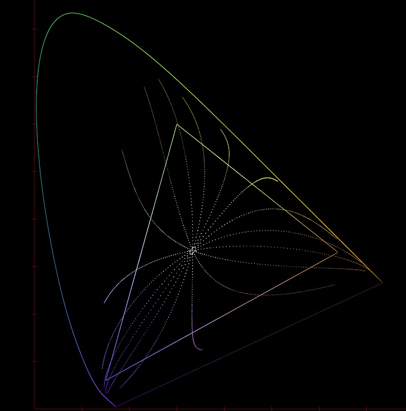
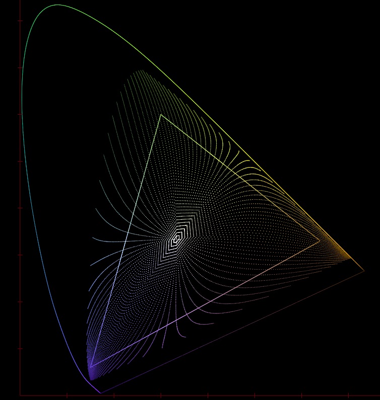
The above chart shows the six primary transmittance curves from before and some interpolated in between curves plotted on the CIE xy chart (in much smaller density increments than the Excel curves from before). Each point on each of the eighteen hue lines is the same transmittance curve at different density values with Dmax at the extremities and Dmin in the centre. This highlights several very important factors that make film so special.
Firstly it shows how film has what could be called “moving primaries”. As the exposure increases the dyes deplete and move towards DMin, the size and shape of the film’s gamut changes dramatically, and it gracefully attenuates to the achromatic point. You can also see this in the transmittance graphs, as the densities decrease all the dyes tend toward a flat pass filter. One way to visualize this is to imagine drawing a line connecting corresponding density points on each curve. The set of shrinking polygons this would make is an approximation of the gamut at each density step. As the size of the available gamut shrinks the reproducible chrominance gets smaller and smaller meaning even a very bright red laser would ultimately only produce a fairly desaturated red.
Secondly the plot shows the hue flights of the film, as the density of each dye changes its hue does not follow a straight line through the CIE xyY space but rather twists one way or another. We can see for example that both greens and reds push toward yellow in the midtones whereas the blues are much less disturbed.
All film stocks exhibit these two features and this is part of what gives each stock its own unique look and feel.
Further visualisations
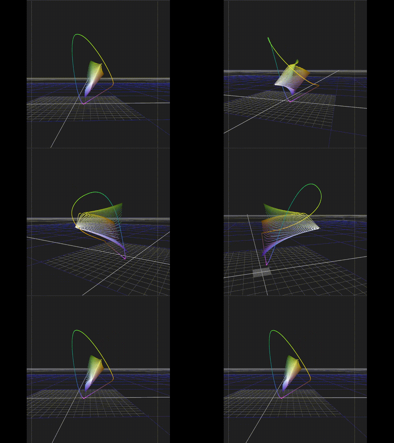
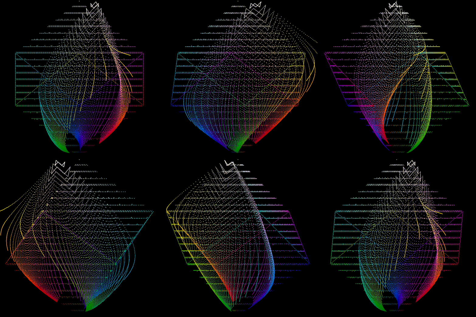
I also moved all the calculations from Excel to Python which allowed me to generate a much denser data set and get a better look at the overall hull of the film.
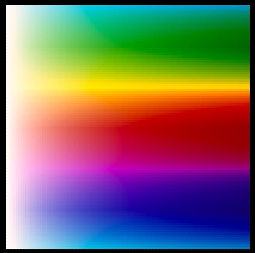
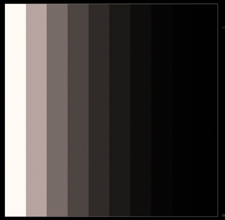
And here are the generated colour and achromatic sweeps matrixed into Rec.709 for viewing.
And here is the film hull compared to the Rec.709 gamut. You can again see the slightly suspect looking yellows which do not conform to the overall closed volume one would intuitively expect.
Verifying the Model
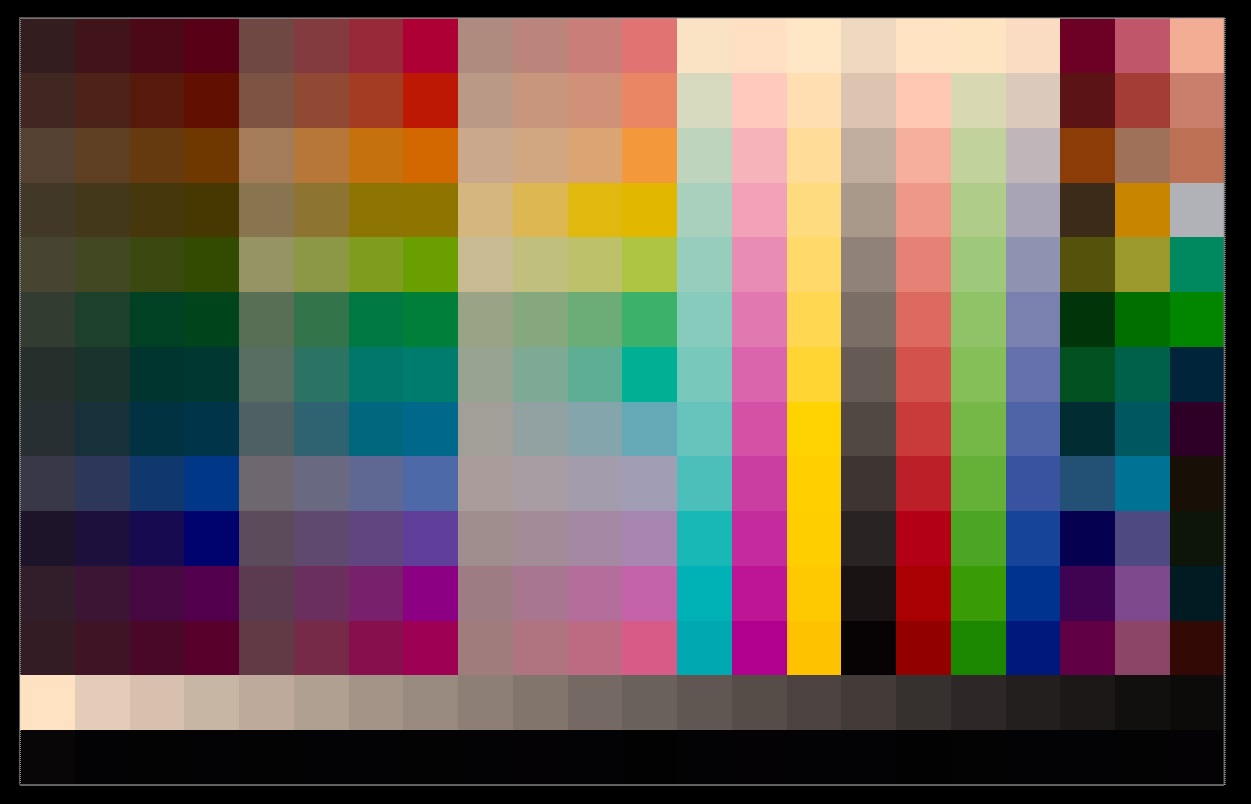
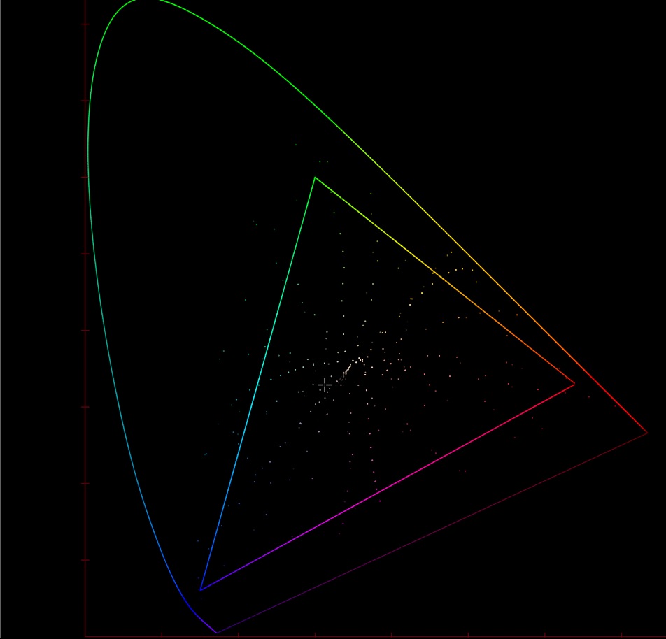
As a quick test to make sure our modelling wasn’t completely off we took some spectral data from an IT8 chart that had been formed on the same film stock and created the corresponding set of patches. These were then plotted on the CIE xy chart and matched our synthetic data extremely well. You can see how the dyes appear to follow roughly the same hue flights and at DMax reach similarly far the CIE xy space.
Modelling the Scanner response
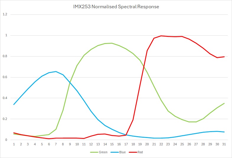
The next step is to repeat all the above but use what we call the scanner observer rather than the CIE Standard Observer. To do that I took the spectral power distribution of the LEDs used in the scanner backlight and the spectral response curve of the scanners camera and convolved them together to form the scanner observer. I could then generate the same set sweeps as before and compare them to the Ektachrome.
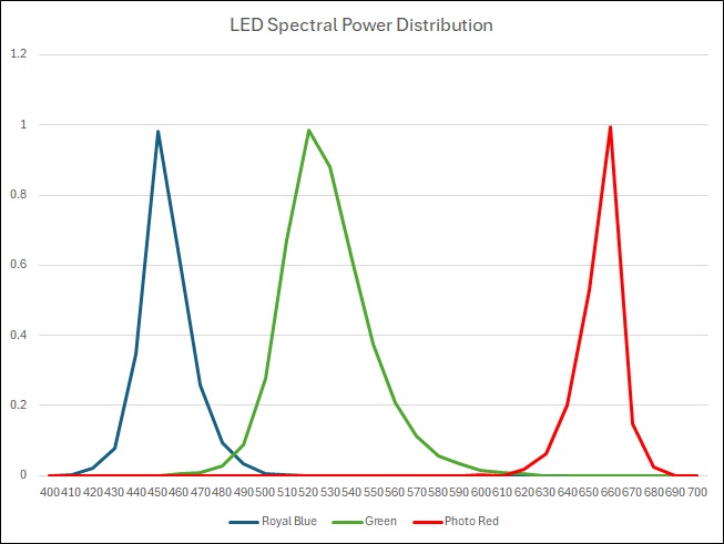
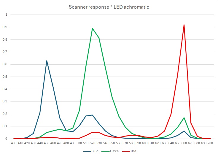
Below is the resultant sweep (right) compared to the one generated with the Standard Observer (left).
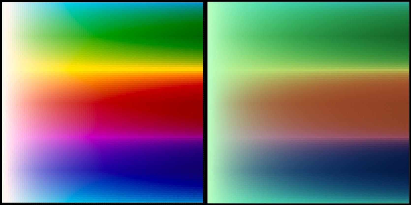
It is immediately obvious that the two are very different looking, for example:
- The reds are very flat and are much more of a drab brown colour
- The greens and blues appear to be roughly the correct hue but are a lot less deep and pure
- The yellow and purple tones are practically none existent
- The rate of change of attenuation is much slower in the scanner observer sweep
- The scanner observer sweep is missing the hue flights of the mixtures, e.g. the green/yellow mixtures push toward yellow as the density reduces, as do the red/yellows in the Standard Observer sweep.
All this leads to an image that feels much less contrasty and is missing all lot of the subtleties and textures apparent when looking at the film on a light box. Whilst I can’t currently show any example frames here it is very interesting to note that the scanned frames exhibit exactly the same issues we can see here (minus the green cast as I suspect the scanner camera white balances that out).
Correction
Given the scanner has no gamut we decided to interpret the results as Rec.2020 and work from there. Using a hue matrix, an inset matrix and some tetrahedral interpolation we were able to get a reasonable match between the two. I ran various test images through this and with a few tweaks got some very impressive results, a lot of the missing punchyness and colour contrast that was the original reason for choosing the film had returned. The main issue currently are the yellow hues, they are coming out extremely saturated and bright. Whilst this is an issue it is pleasing that this is probably the same issue we were able to identify earlier on in the transmittance graphs.
Whilst there is still much work to do and corrections to make this will hopefully make a good basis for the final grading of the film.
Further Work
There are a few issues with the above method that I would like to experiment with further. Firstly, as discussed, the troublesome yellows. Secondly the generated data and sweeps are, for some reason, very lacking in the subtractive primaries. I suspect this is because the sweeps are generated in the density space and then converted to transmittance and this is simply a fall out of that order of operations. I’m hopeful that generating the sweeps in transmittance instead will solve this problem. Finally, this method does not model or take onto account dye mixtures not on the hull (i.e. mixtures of all three dyes) which could lead to blind spots in the data and problems when we try to match the scanner observer sweeps, not to mention cause us to miss interesting insights into the hue flights of the mixtures of the three dyes.
tags: